


In our favorite Gantt chart the execution step is always orange and the cleansing step is blue. A table insert has a different color, purple.
I think it would make sense to show a difference between a full load and an incremental load in the Gantt chart. Perhaps make one of them yellow or darker orange.
Like this:
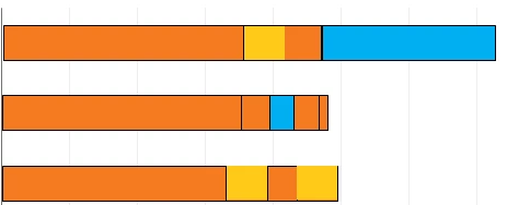
This would benefit beginners that have trouble figuring out why their transformation doesn't do any thing (see this nice meme by

And it would also help in spotting executions that could be incrementally loaded, and other monitoring purposes.