
SUBMITTED

Improved visuabillity for fields and tables

Related products:TimeXtender Data Integration
  • June 8, 2023
  • 3 replies
  • 53 views

Hi All,

Ik would like to see an improvement on the general visuabillity in Timextender of tables and fields. Having a large set of tables en fields makes it hard to keep an overview of your project.

There are already some some things that mark tables and fields, like lookup fields that are marked red and aggregate tables that are yellow.  But a greater set of icons and colors to identify certain properties and changes would make it a lot easier to keep track of the changes that were made.

I think the preferences should be adjustable in a settings menu so each user can decide if they want to use these functions or not.

Some Ideas:

  • Make it possible to group tables and ident the tables in the groups. Maybe even the possibility to make groups of fields inside tables.
    • Group A
      • Table1
      • Table2
    • Group B
      • Table1
      • Table2
  • Show if fields have transformations using colors or icons. I think this is a really important one. 
    • In aggregate tables the transofmration fields have a pruple color so you can easily recognize them.
  • Show if fields have a field validation using the icon of the validation used below.

 

  • Show when there is a data selection rule on a table. Now you can only see if the is a selection rule if you open the mapping and the specific field.
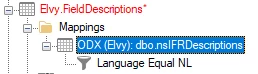
  • Tables that have table inserts.
  • Tables that have custom data

3 replies

devin.tiemens
TimeXtender Xpert
Forum|alt.badge.img+6
  • TimeXtender Xpert
  • June 9, 2023

Hi Wouter,


I agree upon these improvements! Untill this has been implemented into TimeXtender you could use decriptions on a table- and fieldlevel as a workaround to recognize e.g. table inserts, custom data, transformations, etc.


Kind regards,

Devin


Søren Sørensen
Contributor
Forum|alt.badge.img+1

Gents - I agree - upvoted.

I actually use descriptions for exactly this reason … to get the bold highlight as a visual indicator.

In addition to descriptions (aka the bold highlight), I use perspectives a lot for grouping things … especially in an execution context … I think I’ve got more than 30 perspectives on the Komatsu project.


rory.smith
TimeXtender Xpert
Forum|alt.badge.img+8
  • TimeXtender Xpert
  • June 14, 2023

I think it would be great to be able to propagate icons upwards in the hierarchy to show which “things” are going on inside a collapsed node. I.e. if you have a Data Selection rule at the mapping level make it so that icon can also be shown at the table level.

There are a lot of things that can be hidden in a project, especially if you are pulled in to help solve a problem and you did not develop everything yourself:

  • Custom code (shows a little cog on the table level)
  • Conditions, possible at many levels
  • Data Selection rules, possible at Mapping (very hidden) and Table level
  • Pre- and postscripts, only visible through the Advanced menu or by looking at the script usage
  •  Checkpoints, only visible through the Advanced menu
  • Custom table inserts, only visible when table is expanded
  • etc….

Aeons ago, I have suggested to make all these things visible at higher levels and also to be able to add colouring to project objects customisable by the user. You may want to mark things with a colour that you define in your team. Perhaps you mark all items that need cleaning of names with orange and items that need removing with red, etc. This could be implemented with coloured blocks or highlights or something similar.

Similarly it is not always clear what objects are “dirty” as some changes do not make things red, when that would be really helpful.